

Pantone, a global authority in color development and communication, has been influencing product development and purchasing decisions across various industries with its Color of the Year since 1999. This color is meticulously selected by Pantone’s experts who conduct year-round macro-level color trend forecasting and research to identify new color influences.
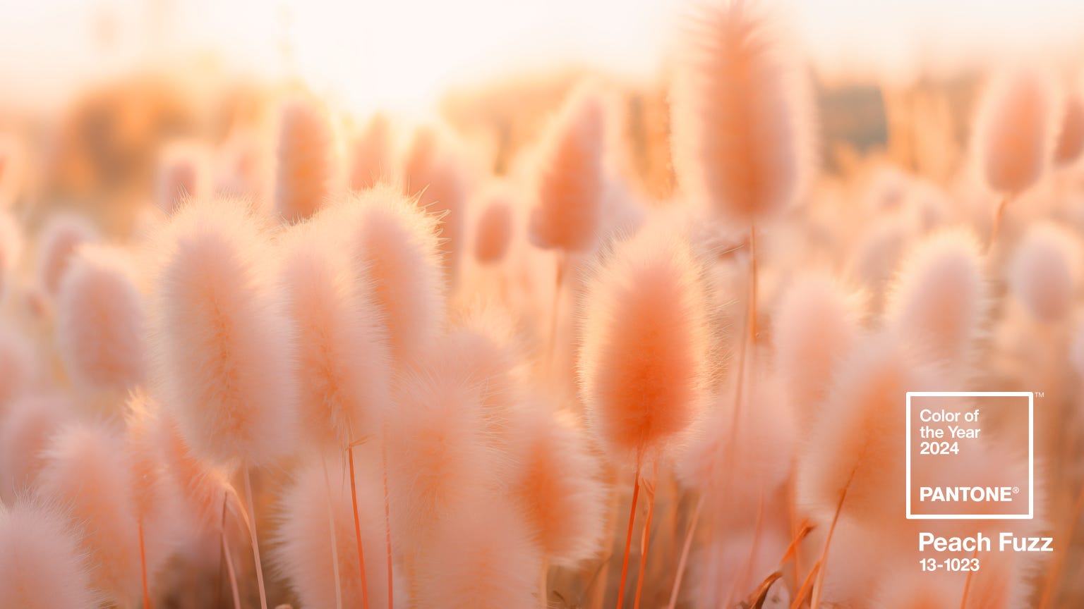
The Color of the Year for 2024 is Peach Fuzz (13-1023). This velvety gentle peach tone is said to capture our desire to nurture ourselves and others. As stated, "It needed to be a color whose warm and welcoming embrace conveyed a message of compassion and empathy."
Color of the Year in Statement and Accents in Packaging
Pantone’s Color of the Year can be strategically incorporated into produce packaging to keep your brand at the forefront of design trends. "Its warm tactility makes it an enticing shade for a variety of products, ... Peach Fuzz tempts the taste buds with thoughts of sweet and delicate scents and treats."
The Color of the Year doesn’t have to be the dominant color on your packaging. Instead, it can be used as a statement color or as an accent to your existing color scheme. For instance, Peach Fuzz could be used in the logo, product images, or even in the typography. This can make your packaging look trendy and appealing without a complete design overhaul.
Impact on Produce Packaging Industry
In the produce packaging industry, the announcement of the Pantone Color of the Year sets off a flurry of activity as designers and brands seek to incorporate it into their packaging strategies. From fresh fruits to organic vegetables, the Color of the Year influences the visual landscape of produce aisles worldwide.
The 2024 Pantone Color of the Year offers a unique opportunity for businesses in the produce packaging industry to connect with consumers on a deeper level. By embracing this color trend thoughtfully and creatively, brands can elevate their products and stand out in a crowded market.
Precision in Color Replication
Our process begins with an in-depth analysis of the design, considering both aesthetic appeal and print feasibility. Most graphic designers create designs optimized for digital viewing, which may not translate accurately to printed materials. These discrepancies can significantly affect the overall lead time and the final appearance of your product.
To bridge this gap, our graphic designers generate a final mock-up, demonstrating: .png?width=435&height=435&name=Untitled%20design%20(57).png)
- Increased quality of small details: Ensuring that even the finest elements are sharp and clear.
- Proper format and resolution: Reviewing images to confirm they meet the high standards required for flexographic printing.
- PMS/CMYK color setup: Adjusting colors to match Pantone standards for consistency and vibrancy.
- Layout precision: Checking margins, crop marks, bleeds, and other elements to ensure a flawless layout.
- Smooth gradients: Creating seamless transitions in color gradients, fading to zero without banding.
- Solid color consistency: Guaranteeing that colors are strong and uniform across all solid areas.
Our art department provides a final proof for customer review and approval. This step is crucial to ensure that every aspect of the design meets your expectations and our quality standards before proceeding to print.
Flexography’s Edge in the Digital Age
In an era dominated by digital printing, flexography distinguishes itself as the go-to method for larger orders and extended print runs. Utilizing flexible photopolymer plates wrapped around rotating cylinders on a press, flexography allows for the efficient transfer of images onto various substrates.
Flexography offers specific advantages, including:
- Custom proofs: Tailored to reflect the final printed outcome.
- Template and die cuts: Designed to fit your unique packaging needs.
By leveraging the strengths of flexographic printing, Fox Packaging ensures that the Pantone Color of the Year—Peach Fuzz—is replicated with precision, enhancing the visual appeal of your produce packaging and making a statement in the marketplace.
Want to incorporate the warmth of Peach Fuzz in your packaging? Connect with our expert art department today to receive packaging label feedback.
