

Color theory is an influential business tool. Studies have shown that using color in presentations and documents creates better understanding and recall of the information shared, in particular this online study commissioned by Xerox found the following1:
- 25% of respondents believe that color improves retention of key facts in materials
- 69% of respondents stated that they understand new ideas better when they are presented in color
- 76% of respondents think they can find information faster if it is printed in color
This data when applied to a packaging and point-of-sale conversation tells us that we should care deeply about how color is used on our packaging to create a connection with shoppers from the store shelf.
In fact, quality has been indicated to be the most important factor in produce sales, and product appearance –including size, shape, mass, color AND PACKAGING – plays a significant role in perceived quality.2
The Importance of Color in Your Packaging Artwork
Psychology of Color
For years, marketers have been leveraging the psychological effects of color in their marketing choices. Even if you’ve never studied up on this topic yourself, you likely already associate green with brands that are fresh, health-oriented or earthy. We all do. Colors trigger certain thoughts and perceptions that marketers know to use to their benefit when developing logos and branded assets. It is important to be mindful of these perceptions during the design process.
If you are interested in more details on this topic, here is a great article we recommend.
The Use of Color
With so many colors to choose from it can be easy to want to arbitrarily choose colors that are appealing on their own and expect that several attractive colors thrown together will only magnify their appeal. But the results can be quite the opposite.
What has been learned over time is that the color wheel offers a few consistent design rules that can be applied to any design project to help you choose colors that perform well together. There are actually three rules to consider and each offers a new color variation to look at.
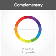 Complementary colors are opposites on the color wheel. Red and green, blue and orange, and purple and yellow are examples of complimentary colors.
The sharp contrast between the two colors make imagery pop; using a complementary color scheme in your packaging offers sharp contrast and clear differentiation between images.
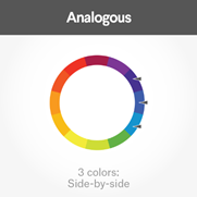
Analogous colors sit next to one another on the color wheel—red, orange and yellow, for example. When creating an analogous color scheme, one color will dominate, one will support, and another will accent.
In packaging, analogous color schemes are not only pleasing, but can effectively influence a consumers’ determination of quality.
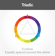
Triadic colors are evenly spaced around the color wheel and tend to be very bright and dynamic.
You’ll notice that the three primary colors - red, blue and yellow - are triadic colors.
Using a triadic color scheme in your marketing creates contrast, simultaneously allowing each item to stand out while making the overall design pop.
The Importance of Mesh Color
Color theory extends beyond the packaging artwork to your mesh color choices. Here’s a great study to explain what we mean.
The School of Packaging at Michigan State University conducted research to identify the impact that produce viewed through a mesh bag had on consumers; tracking attentive behaviors toward packaging, perceived quality, visual appeal, and purchase intentions measured with the Likert scale.2
To test these objectives, six different types of produce were photographed behind four different mesh colors based on the color wheel: monochromatic, complementary, complementary-analogous, and analogous.
| Commodity |
Monochromatic |
Complementary | Analogous | Complementary-Analogous |
| (same color as fruit) | (across from one another) | (next to one another) | (next to the comp.color) | |
| Red Apples | Red | Green | Orange | Blue |
| Oranges | Orange | Blue | Red | Green |
| Lemons | Yellow | Violet | Orange | Blue |
| Green Apples | Green | Red | Yellow | Violet |
| Purple Onions | Violet | Yellow | Red | Green |
| White Onions | White | Black | Orange | Blue |
.png?width=728&name=Color%20Theory%20Quote%20(1).png)
Produce shown with mesh of the same, or an analogous color, induced significantly more visual fixations and more time than those depicted with complementary or complementary‐analogous treatments.3 In other words, mesh does the job of enhancing or detracting from the visual quality of fresh produce, and if chosen well, is an incredibly valuable sales tool.
The Importance of Understanding Different Color Models
One of the most challenging aspects of designing and proofing in a digital world is that color proofing becomes nearly impossible. It is very common for the entire design process between the graphic design team and the client to take place via email where artwork is shared for proofing, edits and signoff. However, the reality is that the color presentation on a monitor is completely different than the color presentation in an actual print out. And to layer on the complication, the color presentation from office printers will not be an exact match to the printing press.
It is important to keep this in mind to avoid wanting to adjust colors on the artwork to appear more correct on a screen. When trying to ensure a proper color match between labels, boxes and film, it is always best to sign off on an actual print proof from your packaging printer when possible.
Let’s quickly breakdown what RGB and CMYK color models mean:
RGB
TVs, screens and projectors use red, green and blue (RGB) as their primary colors, and then mix them together to create visible color variations. Because humans see colors in light waves, mixing light (known as the additive color mixing model) allows you to create colors by mixing red, green and blue light sources of various intensities. The more light you add, the brighter the color mix becomes. If you mix all three colors of light, you get pure, white light.
CMYK
Any color you see on a physical surface (paper, signage, packaging, etc.) uses the subtractive color mixing model. Most people are more familiar with this color model as it is more widely used. In this case, “subtractive” simply refers to the fact that you subtract the light from the paper by adding more color. As process printing emerged and became an industry standard, cyan, magenta, yellow and key/black (CMYK) because the standard color base for mixing and producing a wider variety of colors.
To be connected to a packaging sales representative or graphic artist or to request samples of our signature Fox Fresh Mesh material, email info@foxbag.com.
Sources:1 99 Designs
2 Bix, L., Seo, W. and Sundar, R. P. (2013), The Effect of Colour Contrast on Consumers' Attentive Behaviours and Perception of Fresh Produce. Packag. Technol. Sci., 26: 96-104. doi:10.1002/pts.1972