Artist Collection 2023: Q&A with Designer Matthew Sustaita.
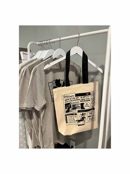
Fox Packaging had the pleasure of working with designer, Matthew Sustaita on our branded merchandise items where he contributed his distinct artistic vision and flair, to show our appreciation to our customers. Matthew’s process of gathering information and insight about our brand provided our team the opportunity to be involved in the creative process. In today’s Q&A with Matthew, we got an in-depth look into this designer’s creative process and how he likes to incorporate his style into his client’s brand identity.
What is your creative process like?
Matthew begins the design process for new businesses by gathering ideas and creating mood boards to determine the aesthetic direction, taking into account client preferences and requirements. He explores possibilities and refines the design according to client feedback. The final phase ensures a polished, client-centric, and adaptable design.
When being introduced to the Fox brand, what were your first impressions?
Before working with Fox Packaging, Matthew conducted research by exploring their website to gain a better understanding of their business. Initially, he perceived Fox packaging as a small business, but this perception quickly changed when he realized the substantial scale of the company. He was pleasantly surprised by their local presence and their ability to provide services within the community, which was something he appreciated and didn't initially expect. 
When the project started, Fox wanted to focus on "60 years in flexible packaging", how did you integrate this focus into your designs?
Matthew has a unique approach to taglines, which involves simplifying them and making them more conversational. For instance, instead of "60 years in flexible packaging," he would transform it into something more straightforward and relatable, such as "That's a lot of bags." His goal is to ensure that even those outside the industry can understand the meaning behind the tagline. By doing this, Matthew makes the taglines more accessible to a broader audience, which ultimately makes them more effective.
How did you include those impressions in your creative approach?
During his walkthrough at Fox, Matthew captured images of machinery and computer systems to gain insight into what employees experienced. From these impressions, he generated ideas and integrated his design principles. The login systems, in particular, sparked his creativity, and he reimagined them with a modern twist while infusing a vintage flair, incorporating new typefaces, and blending in traditional logos. This approach allowed him to create a design that struck a balance between modern design principles and the company's historical logo and traditional elements, thus respecting their existing identity while bringing a fresh, contemporary perspective to it.
How would you describe your art style?.png?width=400&height=533&name=Artist%20Collection%202023%20(2).png) Matthew's design approach is internet-based and purely digital, as he doesn't come from a traditional studio background. He primarily uses digital tools like Photoshop, Illustrator, and various Adobe software for his creative work. His inspiration draws from net art of the late '90s to the early 2010s, which he then adapts to his own preferences and style. In his creative process, he often experiments with typography, demonstrating a strong influence on the digital design trends of that era.
Matthew's design approach is internet-based and purely digital, as he doesn't come from a traditional studio background. He primarily uses digital tools like Photoshop, Illustrator, and various Adobe software for his creative work. His inspiration draws from net art of the late '90s to the early 2010s, which he then adapts to his own preferences and style. In his creative process, he often experiments with typography, demonstrating a strong influence on the digital design trends of that era.
Matthew is a versatile designer with expertise in various aspects of design, including brand design, album covers, concert campaigns, flyers, and tour materials. In recent ventures, he's been exploring 3D typography and custom lettering, creating 3D logos and transferring them into dynamic 3D environments.
In your Fox collection, which elements were hand-drawn?
In his work with Fox, Matthew applied his calligraphy skills to the project, particularly in the area of typography. He created custom lettering for elements such as the Fox logo using a custom calligraphy brush and then brought it into software like Photoshop for further adjustments. While he was careful not to alter the core logo, he did edit other text elements to a certain degree. His editing approach involved subtly obscuring the original font, achieving a blend of both custom calligraphy and traditional typography, thus introducing a unique and harmonious mix of lettering styles to the project. This process allowed him to maintain the brand's identity while adding a touch of his own artistic flair.
What do you hope people take away from your artwork?
Matthew's central objective in his creative work was to establish a unique and unmistakable artistic identity. He didn't want his designs to merely be visually appealing but also to have a distinct signature that made them recognizable as his own. This emphasis on uniqueness was especially crucial because his work involved providing services like designing logos and visual content for clients. He aimed for his clients to see his designs and associate them with his personal touch. His intention was not just to offer a service but to deliver a memorable and influential creative contribution to each project. He aspired to spark creativity in his clients, helping them generate their own ideas through his designs. While he approached his work with discipline, he also valued the fun and charm in the creative process, and he wanted people to appreciate and remember his unique and enjoyable work.
Where can people find your work if they’re interested in purchasing some?https://diosdelghetto.com/collections/all
@diosdelghetto on Instagram


